Eric Carle Museum

TL;DR The Carle tasked my team and I with a website redesign. We conducted research to identify the best audience and problem to design for, ultimately resulting in centralizing resources for educators to enhance their lesson plans.

Background

The Client

The Eric Carle Museum of Picture Book Art is located in Amherst, MA and its namesake, Eric Carle, wrote the hugely popular picture book, The Very Hungry Caterpillar. The Carle has over 11,000 objects, including 7300 permanent collection illustrations, three art galleries, an art studio, a theater, and educational programs for educators, students, adults, and children. Their mission is to inspire a love of picture art and reading through picture books.

The Challenge

Our team was tasked with redesigning the Carle’s website that serves the primary purpose of providing basic information about visiting the museum. The website should also serve visitors who may never step foot in the physical museum by providing them with an accurate depiction of the in-person experience. Additionally, we were responsible with conducting research to identify a specific problem to address with the redesign.

Research: Understanding the Problem​

Learning the Industry

We conducted domain research to get a better understanding of the museum industry at large. We learned that it has grown by 4.2% over the past year (IBIS World) and that technology is “dramatically changing the museum’s relationship with members, donors, and the community. With new technology, visitor and gallery experiences increase learners’ access to content, combine physical and digital experiences, and help in visualizing complex ideas and relationships” (Song). For example, the Met recently digitized more than 380,000 images from its collection, making art available to download on any computer, anywhere. However, museums of all sizes are still “struggling with technology adoption, needing to develop a museum-wide digital strategy, manage the demands placed on resources, and keep pace with technical infrastructure” (Song). We also found out that in order to retain and build their membership bases, there has been a trend in museums making certain events and offerings only available to members, or at least giving them the privilege of having early access to it.

Heuristic Evaluation/Content Audit of Current Site

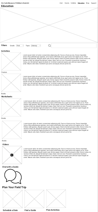
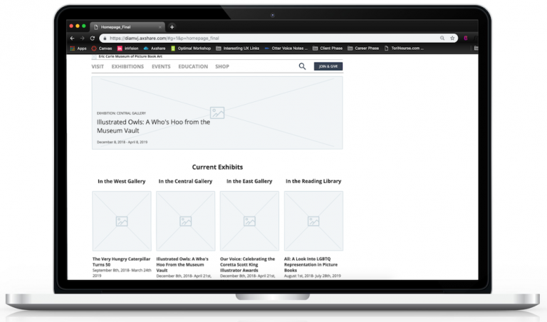
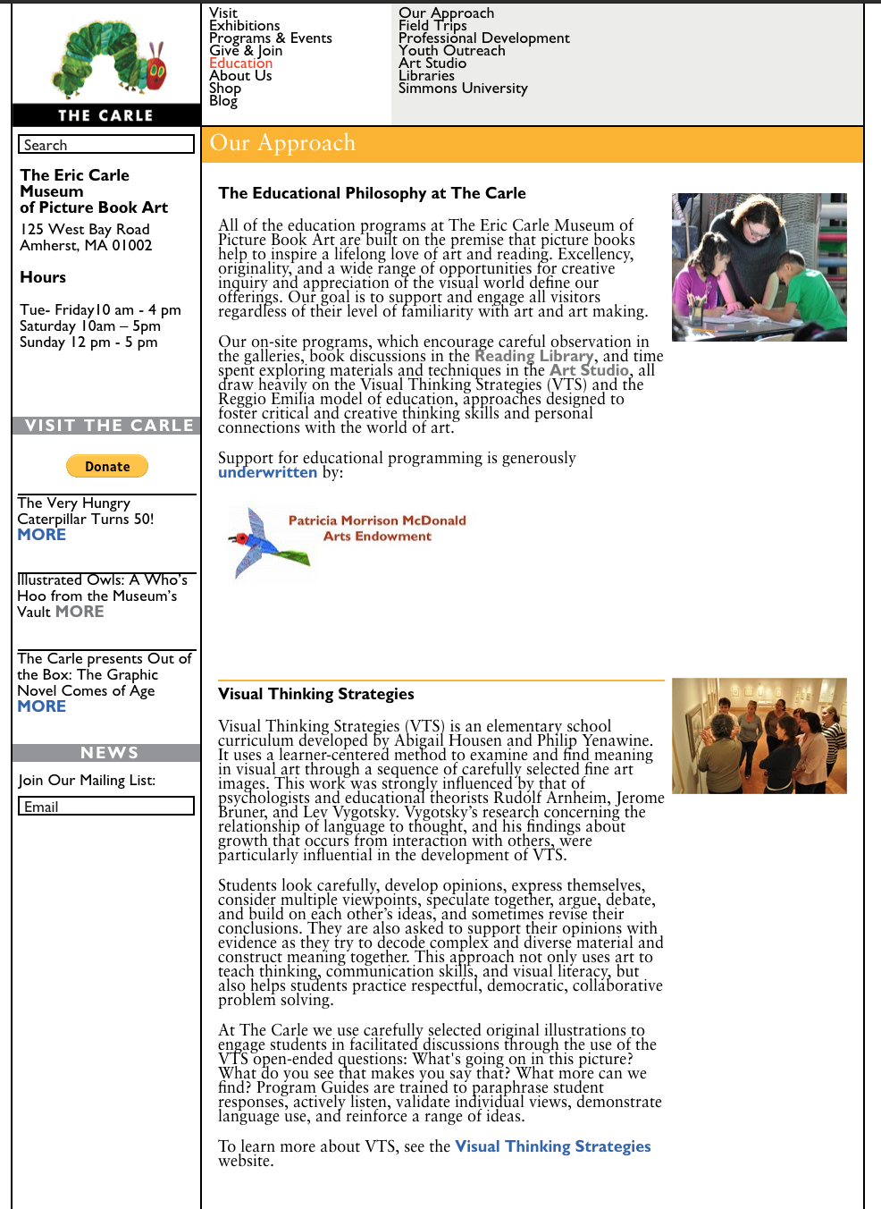
Before diving into our redesign, we needed to familiarize ourselves with the site and conduct a Heuristic Evaluation. The main heuristic issue that arose across the site was aesthetic and minimal design. As the screenshot demonstrates, the current pages are very busy and text-heavy, so we wanted to simplify moving forward.

Another heuristic violation that arose quite a bit on the site was affordance. Links had unclear labeling which confused users and made completing tasks frustrating and require a lot of thought. Lack of affordance was also seen with the site’s lack of clear text hierarchy and unconventional 3-tier top navigation. Because of this, we intended to clarify all of the labeling we utilized and things of that nature when we approached the redesign.

Stakeholder Priorities

We spoke with employees from several different departments of the museum to understand their goals for the redesign. They agreed that the current website was too text-heavy and lacked a minimalist design. Also on the SME’s wishlist was a more responsive and mobile-friendly design, make the calendar more engaging and easier to use, and prioritize eCommerce. Above all, the Carle wanted to grow the reputation and accessibility of picture books and to convey that the Carle is a museum that welcomes children, not a children’s museum.

andrea quote

User Perspectives

Our contacts at the Carle provided us with 15 users who had a connection to the museum ranging from educators and librarians to parents to an author/illustrator. Initially, we wanted to get diverse perspectives from each group, but resulted in varied opinions of what we should focus on for the redesign. After affinity diagramming the feedback and some deliberation, we decided to focus on educators because they represented the largest percentage of our users and had the most compelling pain points. We sourced a few more educators from our own networks to gain further insights and spoke with nine total.

User Pain Points

Insights – Why The Carle?

Competitive Analysis

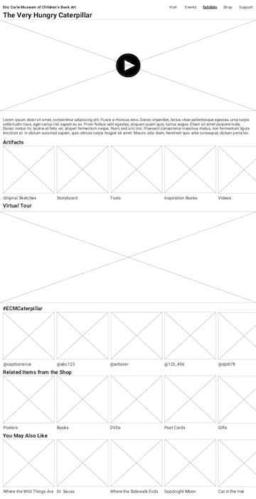
I conducted a competitive analysis to understand what other illustration museums were doing well and identify industry standards on and gain inspiration from other museums that had excellent visual and immersive web experiences.

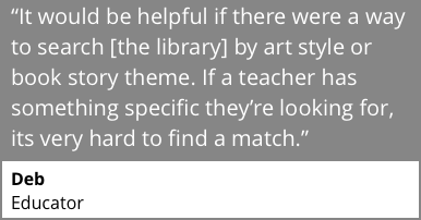
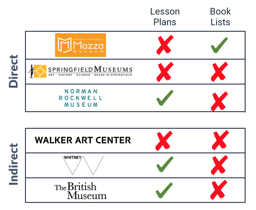
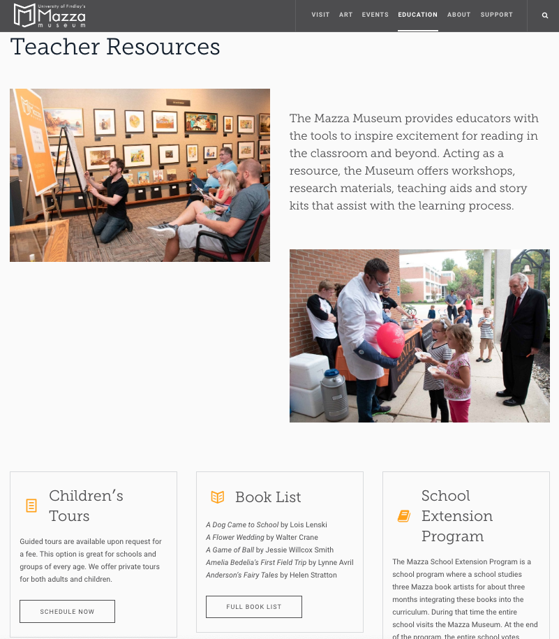
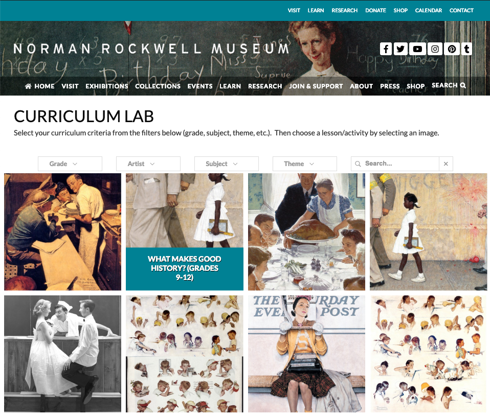
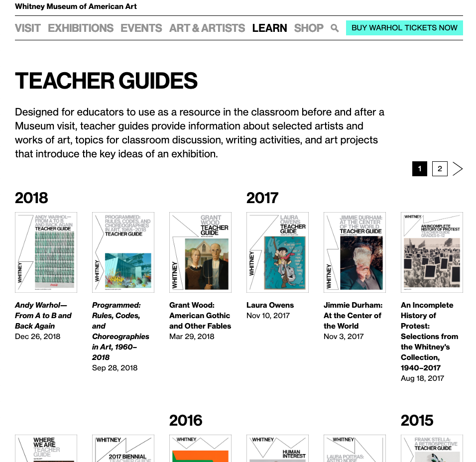
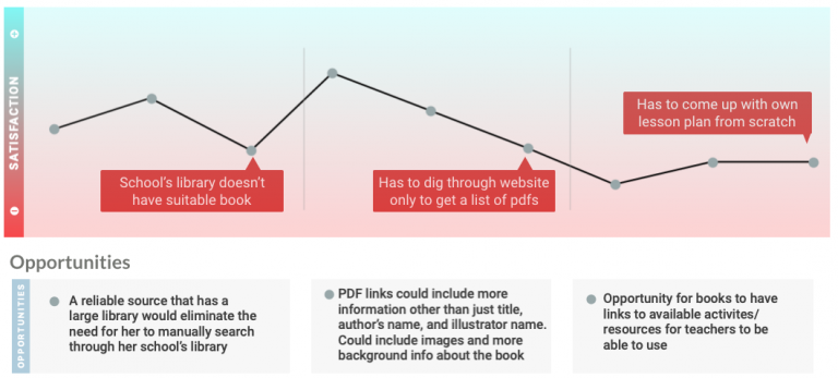
I revisited the competitive analysis once we decided to look through the lens of an educator. This time, I narrowed the categories down to features that were most pertinent to educators: lesson planning and book list resources. Several competitors had lesson plans OR book lists, but none had both. This was an opportunity for the Carle to differentiate itself and be the one stop shop for everything educators need to integrate museum content into the classroom.

Synthesis / Definition: Making Sense of It All​

The User and Their Journey

After synthesizing our research, we created the Shannon persona. Shannon was a summation of what we heard from our users and gave us a perspective to consider as we moved into designing our product.

We also created a journey map to walk in Shannon’s shoes finding resources to supplement her lesson plans and identify opportunities to alleviate her pain points.

Problem Statement

Our initial problem statement focused on an audience that was too broad and included almost anyone who would visit The Carle (children’s book art enthusiasts). The problem it originally addressed could’ve been resolved by making some visual design tweaks to the existing site. Because of this, we revisited the problem statement from the educator’s perspective and the pain points we heard from the users. Our final problem statement was much more specific and actionable.

Elementary educators need access to digital teacher resources regarding children’s picture books to help students develop visual literacy because it is tedious and time consuming to find engaging and reputable content to enrich their lesson plans.

Design Principles

Once we had identified who we were designing for and the problem to address, we decided on design principles to guide us as we moved into ideation for the potential solutions.

Immerse the User

Make site visitors feel like they are at the museum from wherever they are

Show, Don't Tell

Visuals over words, reduce amount of text and simplify descriptions.

Provide the Tools

Give educators access to resources that will help develop their students’ visual literacy.

Ideation: Potential Solutions

Concepting

We were careful not to think let our minds wander to solutions until we solidified the problem and who we were designing for. Once we these were settled, it was time to start thinking of solutions for Shannon’s problems.

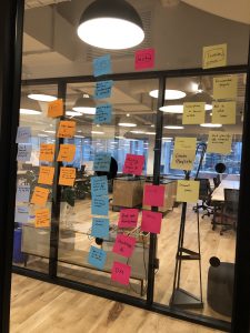
We started ideation by doing a mash-up exercise to see how we could emulate features from websites we enjoyed using with our solution for educators. Sites included Vimeo for its organization of video content, Contiki for how they leverage images and video over text to describe experiences, Pinterest for the board-like saving and mechanism to find inspiration, TED Talks for their educational content organization, Instagram for a visual endless scroll, Netflix for categorizing and recommending content, Google Maps street level to feel like they’re in a location from a distance, Eventbrite to organize and find events, and more.

Concepts to Test

We were careful not to think let our minds wander to solutions until we solidified the problem and who we were designing for. Once we these were settled, it was time to start thinking of solutions for Shannon’s problems. We ended up ideating four concepts to solve the educator’s problems of finding resources to amplify their lesson plans.

Education Portal

Description

A resource for educators to enrich their classroom experience with relevant content like activities, worksheets, or videos. It was important to include filters and categories so educators could quickly find resources that fit their needs. The original concept also allowed educators to directly purchase books from the gift shop.

Feedback

Educators really liked this concept, but they would want more robust search features to ensure it aligned with their class and lesson. Other activities, like arts and crafts, would need to a relevant tie in to the lesson curriculum to be useful. We also heard that educators didn’t want the connection to the shop  because they have very limited budgets and typically lean on the school library or other free resources for books or other classroom materials. Overall, educators felt like the content, topics, and prompts would be incredibly helpful for the classroom.

Visual Immersive/Interactive Exhibits

Description

An immersive experience that makes the user feel like they’re at the Eric Carle Museum. This concept was intended for users who lived far from the Carle and wanted to experience the museum exhibits. Educators could easily show a video overview of the exhibit and photos of artifacts to their classes as well. They could also see other visitors’ photos from the social media hashtag to get a sense of what it was like to visit the exhibit.

Feedback

The primary feedback we heard from educators on the immersive exhibits concept was that the content would somehow need to be tied back to the Educator Portal, and ultimately be something they could incorporate into a lesson plan in the classroom. All users really liked the “virtual tour feature” to feel like they were walking the halls of The Carle. Some users also wanted archives of past exhibits and a view into the artifacts in the vault not currently on display. Users also wanted more background content about the artists’ processes.

Guided Bookstore

Description

A virtual repository that aids in finding relevant books used as a supplement in advancing student’s visual literacy. The bookstore/library was our solution to a more visual representation of the “Best of the Best” booklist PDF The Carle publishes every year. We aimed to provide more details and filters beyond the title and author so that educators could understand if it would be a fit for their class.

Feedback

Users were initially confused by the use of ‘library’ throughout the pages because they thought books could be checked out online. Educators expressed that they needed more details about he book, including the reading level, subject, art type, etc. They also reiterated that they would like the books to tie back to the educator resources so that they could easily access related activities and worksheets related to the book for a cohesive lesson plan.

Event Finder

Description

A platform implemented to keep users up to date with past, ongoing, and upcoming events. The current event listings are fragments across several different areas of the Carle’s site. This concept aimed to consolidate that information into one place where a user could see upcoming and past events. Educators could find relevant events to plan a field trip around.

Feedback

Users thought the look at today and this week’s events was too near-term because it’d be hard for them to plan a trip so last minute, especially if they brought their class or lived far from The Carle. This concept resonated the least with our users.

The Final Solution

After finishing concept testing, we decided to move forward with the Educator Resources and Guided Book List concepts because they resonated the most with our users. They were also likely to alleviate their biggest pain points finding reputable content to supplement their lesson plans.

We added filter and search options to allow educators to easily find relevant resources that fit their lesson plan. Overall, we also leveraged visuals over text to simplify and stick to the ‘Show, Don’t Tell’ design principle. 

Check out the interactive prototype

Redesigned visual homepage
Education Portal that provides teachers that allows teachers to find relevant activities, videos, and worksheets to supplement lesson plans
Redesigned "Best of the Best" book list with more robust search options to make it easy to find relevant books tied back to educator resources

Future Considerations

Future considerations for the Educator Portal would be to add more detail about the illustrator in addition to the author in the book detail page. We would also like to do further testing on the filtering to ensure all the book metadata would be filterable when educators were browsing resources. Next steps to implement the Educator Portal and Book List would be to collaborate with the Carle’s development team to understand the backend feasibility to manually tag their books. We would also need to work with their marketing team to get the word out about these new resources so that educators come looking for them. Finally, we would dig deeper into the immersive exhibits concept again to create a stronger connection between The Carle’s education resources and their world-class exhibits.

What I Learned as a Designer

This 5-week sprint taught me a lot about my UX design process and myself. It was easy to jump to solutions during sprint 1 during the research phase, but I found that it was impossible to successfully go down that road before completely synthesizing the data. Once we got into concepting, I learned how to deal with the uncomfortable feeling of thinking outside the box and quantity over quality, even if the idea wasn’t exactly correct or technically feasible. Above all, I learned to deal with ambiguity and that it’s ok (and can even be fun) to be uncertain about the direction the project will take. I was convinced early on that making the site more visual and cleaning up the information architecture would be enough to solve our users’ issue, but we realized we had a more in depth problem to solve for the core educator audience.