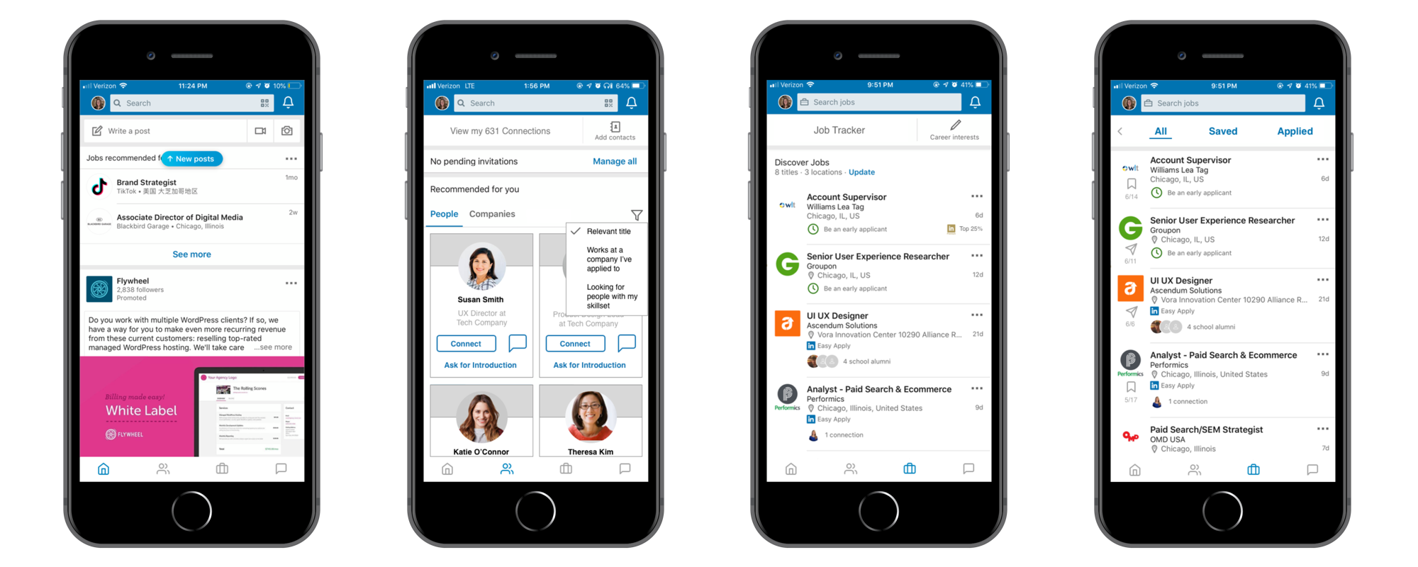
TL;DR I made some design and content tweaks to the LinkedIn mobile app with a focus on improving the process for job hunters to find meaningful connections and relevant job opportunities.
Background
The Client
LinkedIn is a business and employment-oriented service that operates via websites and mobile apps. Founded on December 28, 2002, and launched on May 5, 2003, it is mainly used for professional networking, including employers posting jobs and job seekers posting their CVs. (Wikipedia)
The Challenge
After recently graduating from Designation, I’ve been spending a lot of time making connections with others in the UX community and of course, job hunting.
— Enter LinkedIn —
This tool offers an invaluable network consisting of secondary and even tertiary connections to find valuable people in the industry. However, I’ve found that there is a lot of fluff and irrelevant content that makes it time-consuming to find the right person to reach out to or job to apply to.
I have been using a Google Sheets document to keep track of job application progress and manually curating this tracking doc can be tedious and runs the risk of human errors. There are third-party tools I could use for this, but I’d like a native tool to keep track of everything in one place since I’ve been primarily using LinkedIn for my job search — a robust job tracker is currently lacking in app.
I’ve found through previous job hunts that key to success in finding a job is threefold. These were the key things I wanted to cover in my redesign.
- Sometimes it’s not what you know, but who you know
- Tracking and organization
- Staying in the loop on industry trends
*Note: This was an unsolicited redesign project for personal learning purposes, and may not align with LinkedIn’s internal business objectives or constraints.
Areas to Improve
Home Screen/Navigation
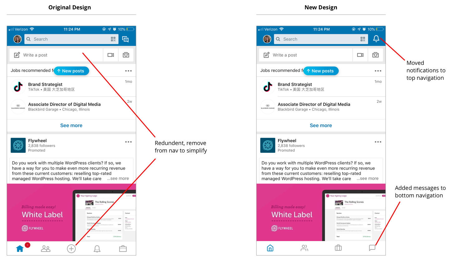
The feed to share updates, repost articles, and engage with content by liking or commenting is a core component of any social media platform (i.e. Facebook, Instagram, Twitter, etc.), so I intended to keep that at the forefront. It is also a key way to stay informed on industry news and trends.
I wanted to tweak the navigation to make it more conducive for job hunters. I found that the post text field and post bottom navigation icon were redundant, so I removed the post icon from the bottom nav to make space. I then moved messages from the top navigation to the bottom to make it more reachable since the top right corner can be a stretch. Another consideration for this was that communication and building relationships is such a key part of job hunting and notifications aren’t always relevant.
Making Connections
Both my very first and most recent jobs were from a referral, so I’ve seen first hand how important a solid network can be to finding a new gig. As someone newer to the UX industry, I am looking to make connections in the community and find smart people to learn from. I am also trying to navigate working with recruiters to figure out if I could be a fit for a position they are trying to fill.
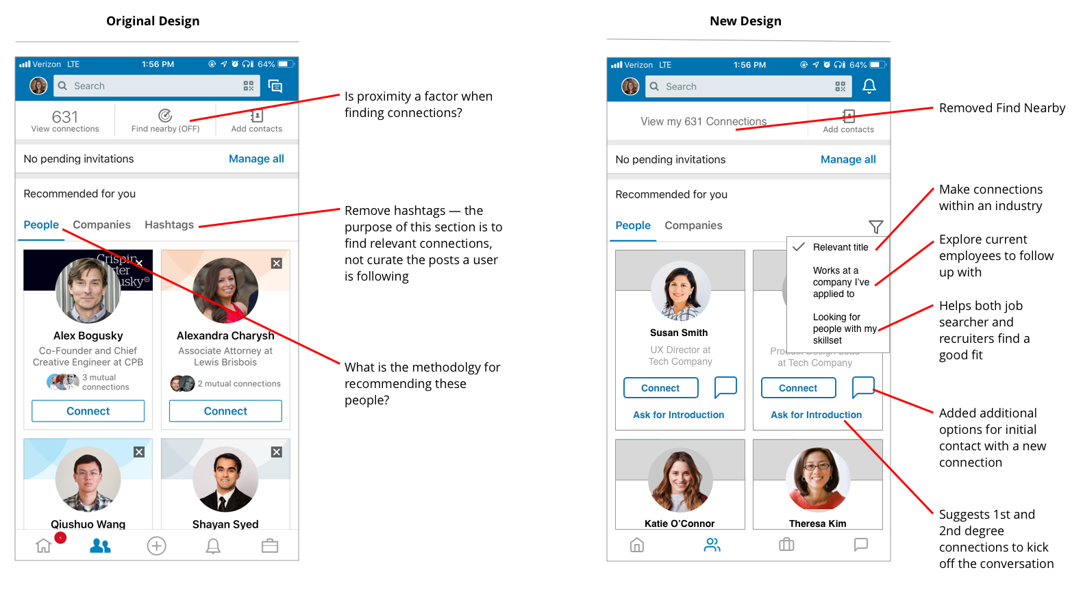
Close proximity to my current location is not a factor when considering who to connect with, so I eliminated the “Find Nearby” tool in my redesign. I also felt that the hashtag settings did not belong in the discover connections section and would fit better in general account or news feed settings.
My current connection recommendations appeared to be secondary connections outside of my industry (i.e. an attorney with only two mutual connections). I added filter options to make it easier to find relevant and meaningful connections.
Deciding the best way to make initial contact with a new connection can be tricky. Personally, I feel like sending an invitation to connect with someone I’ve never met can feel a bit impersonal. I usually try to be introduced by a mutual connection or send a preliminary message to break the ice, these preferences are reflected in my redesign.
Job Search
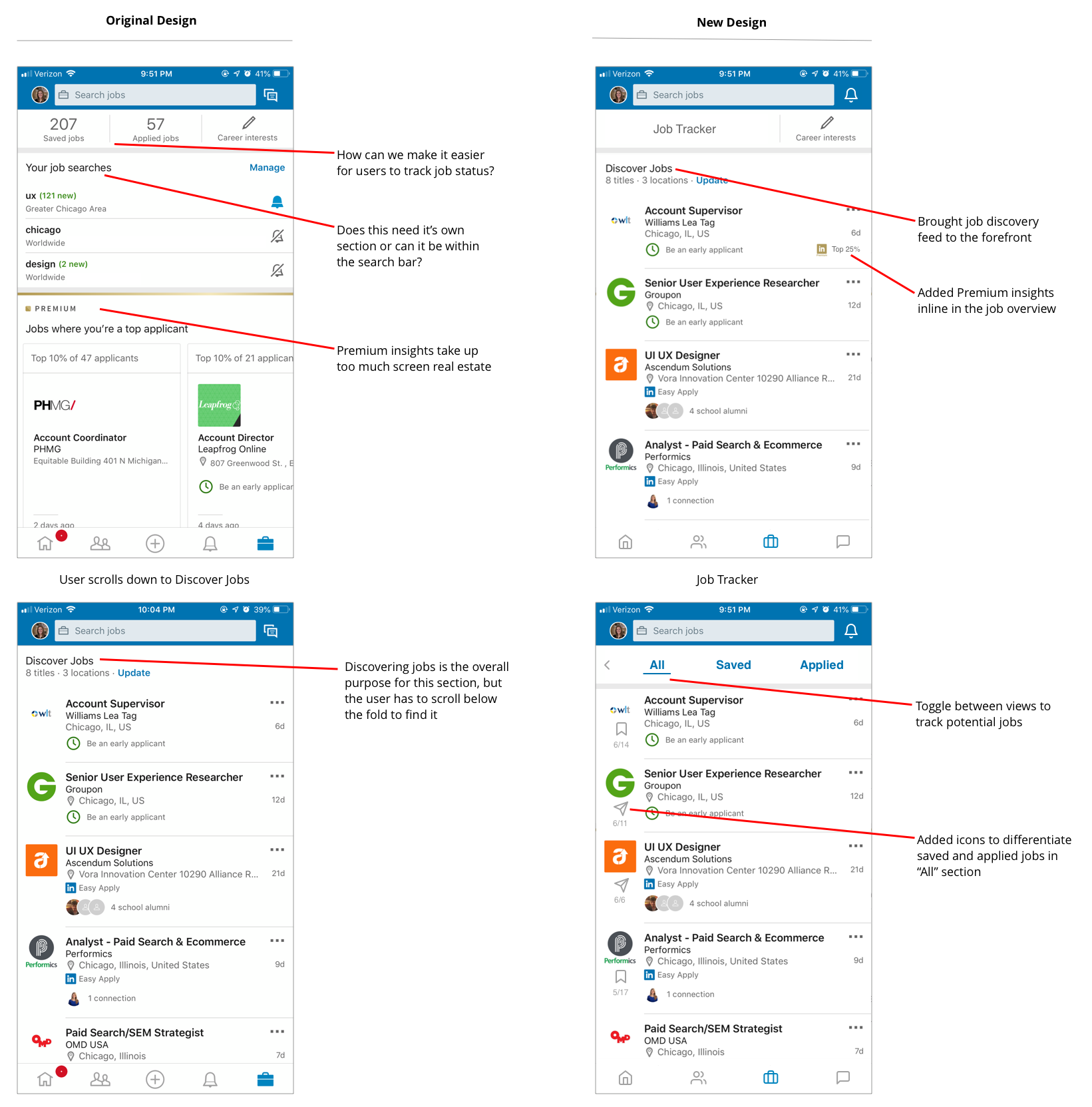
Searching for jobs on LinkedIn is probably my most used-function of the app right now. The current tool has some extra “fluff” like showing premium insights like which jobs I’d be a top candidate for and my job search history that takes up a lot of screen real estate. Eliminating and consolidating these things made the Discover Jobs endless scroll the forefront of this section of the app.
The other key aspect of searching for jobs is maintaining organization of jobs/companies I’m interested in and tracking of the jobs I’ve applied to. I consolidated saved jobs and applied jobs into a new Job Tracker section of the app where I can track when I’ve applied to a job and follow up on the jobs I saved to apply to later.
Final Thoughts
This was a fun challenge to improve a tool I use in my daily life. I strove to not only make changes that I selfishly wanted for my job search, but also things that would help the broad LinkedIn user base and increase engagement with the app. It was also interesting to work with existing conventions and features versus creating a new product from scratch.
