
TL;DR Jugl is a start up family organization app that approached our team to help identify the best solution and path to pursue. We conducted a variety of research and concept testing and created a solution for organizing carpools. We delivered a prototype of this mobile app and task flows outlining how it integrated with their current calendar and sourced information.

Background
The Client
My team was assigned to work with Jugl, a Chicago-based startup with an app that is striving to help families, particularly working moms, organize their schedules and logistics, like carpooling, since it currently takes a lot of manual and disorganized coordination methods. Amy, Jugl’s founder and CEO, started the company in 2017 and recently launched a beta version of a calendar app that users can assign drivers to/from events. The Jugl app also has a “Jugl Assist” feature that allows the user to send a photo to Jugl so it can be add an event to their calendar. Jugl Assist currently requires someone from the Jugl team to manually input the information into the user’s calendar, but they envision it becoming an AI solution in the future.


The Challenge
Amy approached Designation to help take her app to the next level. She learned during beta testing that users had existing calendars and weren’t likely to switch to a new one. She was honest about the beta’s shortcomings and had an open mind of what Jugl could transform into besides a calendar — it was up to our team to figure out what that might be. Jugl’s near-term goal was to engage users with their solution and understand the best path to pursue. Long-term, Jugl seeks to make it easier for users to capture, disseminate, and execute on the information coming into their households.Research: Understanding the Problem
Familiarizing Ourselves with the Landscape
I conducted domain research to understand how families currently coordinate their logistics and schedules to validate the information we received from the Jugl team. I found that many families hold weekly planning sessions to get on the same page about the 5 C’s (calendar, carpool, cooking, chores, and children) and one family member typically owns organization. Families are very inundated with their current calendar solution and have methods like color coordination, code labeling, shared calendars, etc. The household organizer is also choosy about how many activities to enroll their children in as to not overwhelm themselves or the children.
Talking to Stakeholders
During our kickoff with the client, we discussed their goals to engage their customers and find the best path to pursue. They ultimately wanted to make it easier for people to capture, assign, and manage information. We also heard that users need a reliable “source of truth” that all of their existing calendars and schedules from various sources would feed into. This would allow the user to check one central place instead of referencing several different sources that may not be the most up to date.

In addition to our client, we decided to speak to organization “subject matter experts”, so we spoke to 5 former personal assistants. They shared some great insights, including:
Best practices for organization:
- Start day with an overview of what's going on
- Create a daily to-do list
- Take care of tasks as they arise and prioritize
- Create a system or code for entering information
- It is essential to have visibility of other's calendars to schedule
- Assigning task accountability increases efficiencies
After speaking with the SMEs and stakeholders, it was time to speak with the users to understand their perspectives and identify goals and frustrations to address.
User Perspectives – Pain Points
We spoke with 5 users who provided us with additional insights, pain points, and goals to consider.


- Ingrained systems: users have various systems to organize their families, ranging from a weekly Excel spreadsheet to handwritten to-do journals
- One organization owner: one member of the household typically owns family organization and lacks a way for other family members to visualize the information and a way to hold others accountable for delegated tasks
- Group text dark hole: Many users rely on group texts to coordinate with other parents and struggle with the text thread getting long and convoluted, risking important information getting lost in the shuffle
- Difficulty driving adoption: several users have shared Google calendars with their spouses and helpers, but struggle getting them to fully adopt and rely on it
- Users are unlikely to shift away from the calendar system that has been working for them
User Perspectives – Goals
Competitive Analysis
I looked at direct competitors in the family organization space to identify industry standards and areas for Jugl to differentiate itself. I also explored indirect competitors to gain a broader understanding of more general organization and coordination solutions. I revisited the competitive analysis later when we dove deeper into carpooling.
Direct Competitors: other family organization apps
All family organization apps include shared calendar, to-do lists, and photo sharing features. Most also had the ability to find recipes and add ingredients to a shopping list.
Picniic was the most robust competitor and had unique features like location tracking, ability to assign tasks to specific users, and storage for important information like insurance, passwords, and addresses.


Indirect Competitors: general organization and carpooling apps
I looked at other organization apps to understand solving organization problems at a broader scale. The key things they did well was sharing calendars and to-do with others, viewing others schedules, consolidating information from multiple places into one tool, and allowing the user to control what to
After refocusing on carpooling, we looked at carpooling apps like Figure 8, Carpool Kid, and Go Kid. I also looked at Life 360 that families use for location tracking. I evaluated what they were doing well that could be mimicked (i.e. assigning responsibility, automating processes, and location tracking/saved locations) and what could be improved upon in our product.
Synthesis / Definition: Making Sense of It All
Persona
We developed the persona, Katherine, as a result of the research we conducted to represent the user we were designing for. We kept her in mind as we worked through the ideation and design processes.

Problem Statement
Working parents struggling to balance personal and professional responsibilities need a centralized tool to organize their family’s busy schedules and create accountability for tasks because they currently lack clear ownership and schedule transparency.
Design Principles
After conducting the research and interviews, we decided upon three Design Principles to help guide us as we began to think about the solution.
Streamline
Consolidate and disseminate information into one consistent and reliable source
Instinctual
Make suggestions to reduce mental labor by learning and anticipating user behavior
Proactive Prevention
Provide users with a way to organize, delegate, and create accountability to mitigate preventable fire drills for peace of mind
Ideation
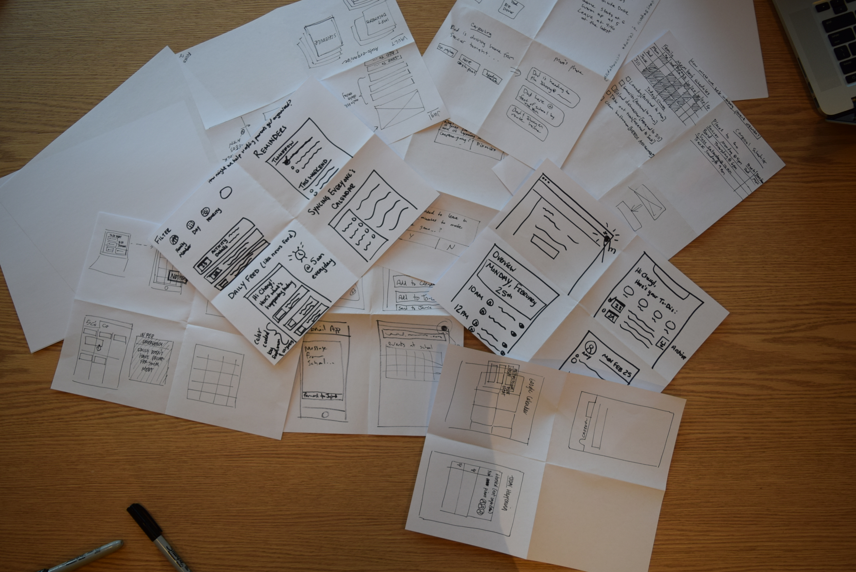
With our persona and design principles in mind, we starting thinking about potential solutions. We kicked off brainstorming by played a few rounds of Crazy 8’s to start thinking about different approaches to the various “how might we” questions we identified to uncover viable solutions. Questions included:
- How can we help families organize?
- How might we learn from past behavior to inform future behavior?
- How can we create accountability?
- How could we mitigate back and forth communication?
- How would we handle things when they don't go according to plan?

Concepts
After completing the rounds of Crazy 8’s, we had about 20 concepts. We combined similar ideas and categorized them. We then voted using dot stickers and deliberated about which ones we should test. We ended up selecting seven concepts to test with our users.
These seven were selected because other concepts already existed in iPhone native capabilities, resolved a specific user’s frustration and not the audience as a whole, was a better fit for desktop and Jugl is prioritizing mobile, or would be too complicated because information would be passed back and forth through a two-way channel.
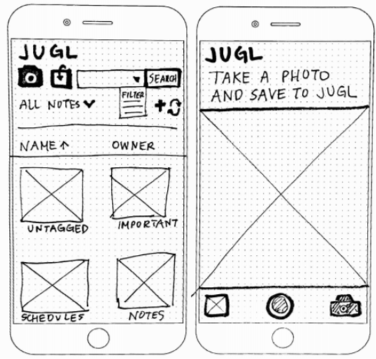 An easy and smart (AI) way to save and revisit files and photos. This concept was selected because it helped organize the users mentioned that they take photos of physical schedules from the school or sports teams and lose them in their camera roll.
Feedback: Users currently have so many pictures that it’s difficult to organize them and they don’t want to take the time to create folders. They didn’t feel like this had enough added value beyond their iPhone photo albums to utilize it in a new app.
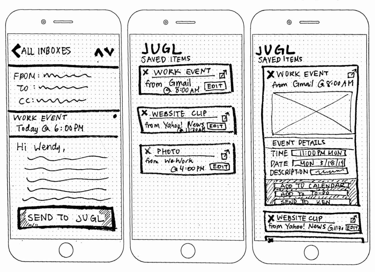 A way to send Jugl your emails, website clips, photos. It makes sense of users emails, auto-create an entry, and then choose options for what to do after. This concept addressed the Jugl client’s goal to become a central “source of truth” for all of the various emails users receive from various sources and allows them to decide what to do with that information.
Feedback: Users felt that forwarding items to Jugl then deciding what to do with them was an extra step in organizing information
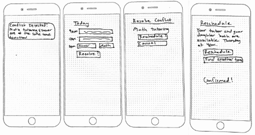
Anticipates scheduling conflicts and helps users find a resolution. Smart technology anticipates or prevents a conflict before it becomes an issue. We heard that users have a difficult time scheduling back to back events with unrealistic commute times, so this would also prevent that from happening.
Feedback: Users rarely double-book themselves, if they do they are aware of it. Prevention was preferred over reactive resolution. Time constraint alerts for next events resonated with users the most.
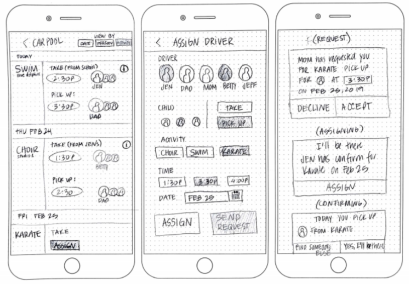 A way to manage carpools that automates the process of communication between drivers by sending messages for you to confirm and coordinate. The goal of this concept was to mitigate the long and exhausting group texts users were frustrated with and assign clear ownership.
Feedback: This concept resonated very well for users because they currently coordinate carpools via a muddled group text. They felt that this would centralize it and assign accountability, to eliminate the need for the group text.
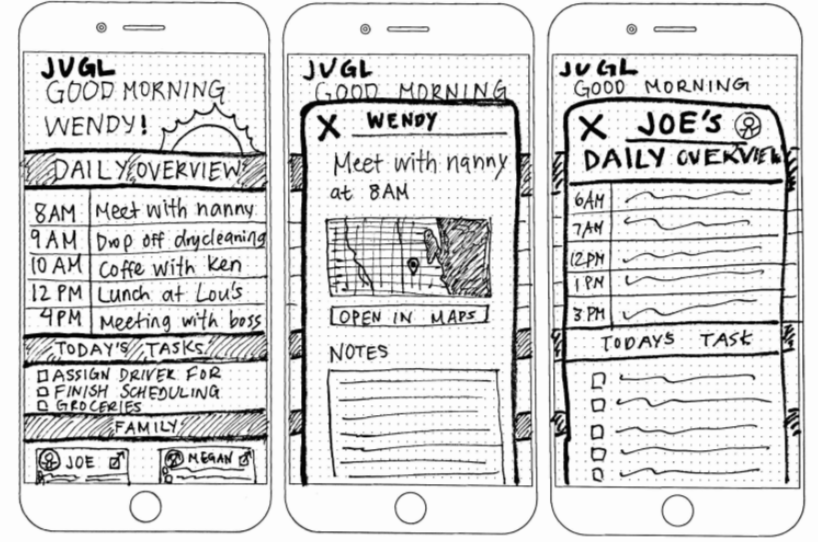 An overview of today’s activities happening within a user’s Jugl family. Many users mentioned needing an overview of the day so they could plan ahead and easily see family members schedules.
Feedback:
Users felt that actionable insights were more valuable than a basic overview and would like to receive it the night before to prepare for the next day. They also felt like the calendars they already use currently provides this feature.
![]() Keep everyone in the loop with real-time updates about carpooling process and locations. This concept was intended to remove the need to group text about carpool progress since users could reference the tracker to know ETA and location.
Keep everyone in the loop with real-time updates about carpooling process and locations. This concept was intended to remove the need to group text about carpool progress since users could reference the tracker to know ETA and location.
Feedback: Users liked having a way to see their child’s ETA so they could plan around it (i.e. making dinner or not). They also felt like this would eliminate communicating via group text to update on carpool progress.
![]() An easy way to track and assign tasks to people for the home, school, and business. View tasks, add subtasks. This concept was inspired by the users’ frustrations registering their children for summer camp. There are so many forms required and due dates to keep track of that this would be a centralized hub to store and manage everything.
An easy way to track and assign tasks to people for the home, school, and business. View tasks, add subtasks. This concept was inspired by the users’ frustrations registering their children for summer camp. There are so many forms required and due dates to keep track of that this would be a centralized hub to store and manage everything.
Feedback: Users already had a system in place for managing to-do lists and didn’t have the time to learn and implement a new solution. They also felt like the kanban boards were over-kill because parenting tasks were not complex, they just had a large volume of tasks.
Selecting the Solution
After reviewing the data we gathered from concept testing, we tallied at the users’ votes for their favorite concepts. Their top picks were organization tools, but they use a variety of familiar tools and methods to organize. Users were not likely to change to a new system unless it was very well established, trustworthy, and had a bigger value proposition that would make it worthwhile to switch. When looking at their votes again, we noticed that they all had the Confirmation Coordinator and Driver Tracker listed in their top-three because it was something unique and would solve the common challenges organizing a carpool. Their votes reinforced what we heard during user interviews that coordinating carpools was a pain point for almost all of our users and they would do anything to get out of the group text “black hole” that currently exists.


We looked at the market opportunity and noticed how saturated the organization app market was and recognized there was limited opportunity to penetrate this market. This validated our belief that the carpooling confirmation coordinator and driver tracker was the more viable option.
Before going all in on carpooling, we wanted to present our findings to the client and ensure we were aligned. We gave them two options:
1. Zoom out and explore an undetermined organization solution that would solve all three of Jugl’s goals (capture, manage, and assign information)
2. Zoom in and focus on the Confirmation Coordinator and Driver Tracker concepts that resonated with users, but only solved the manage and assign goals
Ultimately the pros of zooming in outweighed the cons of zooming out.


Creating the Prototype
We decided to flesh out the new user onboarding, creating a carpool, assigning drivers, and tracking carpool processes in our prototype because they were the key components of the carpool coordinator tool. We considered a few different approaches to each section, for example we thought about pulling in calendar visibility like Outlook calendar or using AI to assign a driver and exact map tracking like Uber or a progress bar for ride tracking. Initially, we all wanted to take a stab at each component of the product, but we ultimately had to divide and conquer due to time limitations. I owned the onboarding and creating carpool sections.


Additional Context
We presented the final prototype to the Jugl team and while they liked what we put together, they had some questions. How would this tool integrate with their existing calendar app? Is this something that would appeal to both working parents and stay at home moms? How is all of this information getting into the system? How would it work for non-Jugl users?
We realized that the client wasn’t 100% bought in on our solution, so we went back and revised some areas of the prototype to display how information flowed into the app and integrate the carpooling section back to the existing Jugl calendar app. We also created extensive task flows to ensure the client was clear on how the product worked and where information was being sourced.
Task Flows
We created task flows for the client to demonstrate how the system would source or communicate information if a user had/had not completed their profile or were/were not Jugl users. The task flows also helped demonstrate how the carpooling feature would tie back into the current Jugl calendar app.
Final Solution
Our final solution after we refined the prototype based on feedback during usability testing and better-connected the carpooling feature to the existing Jugl calendar solution. Check out the interactive prototype.


Future Considerations
Future Considerations
We had some additional ideas for Jugl to consider down the road. These ideas include pieces of feedback from usability testing and things we didn’t have time to explore in depth due to the short length of this project.
- Team Snap/Sports Engine integration to pull in team schedules and roster information. The roster would help parents find people to carpool with and ingest who would need to be in the carpool into Jugl.
- Jugl app version for kids. Most parents we talked to had younger children who didn’t have phones, but there were a few with teenage kids who would like an app for them to know who was picking up that day.
- Analytics report to help hold users accountable and reward users who often volunteer to drive.
- Solution for non-driver coordination. Some users only use public transit or bike.
- Carpool recommendations by proximity. Lets the user know someone on the team lives nearby to encourage a carpool.
What I Learned as a Designer
What I Learned as a Designer
I learned to stand by recommendation and make a case for it. I was an adamant supporter of the carpooling solution because it was Jugl’s key differentiator (even during their beta) and it was a frustration our users expressed repeatedly. I also learned to dive deeper into the details and how to convey them to a client to increase their understanding and likelihood to buy into the product.
